[Data Science Project] Who Controls the World Trade of Soybeans and Beef? A NetworkX Analysis in Python
Project Description
This project was launched from individual research in the George Mason University course CSI 500, Computational Science Tools. Reading an academic journal, Social network analysis of virtual water trade among major countries in the world, led to this project to observe ways to academically analyze world trade data using the networkx package in Python.
Journal Article Summary
[Deng et al. (2021)] Social network analysis of virtual water trade among major countries in the world
This study observes the virtual water trade strategy among 19 major countries from 2006 to 2015. The virtual water strategy refers to how water-scarce countries and regions replace their water. Using a multi-regional input-output model and social network analysis using data sources from Eora Global MRIO, it thoroughly explains how water trade operates throughout the world.
Research question and research gap
This study aims to understand how global virtual water trade is structured using network theory. Even though several studies were previously done, there were research gaps and inconvenient calculations for the volume of industrial and service industry products due to their complicated computation processes.
Method
- Input-output model
This method can be divided into a single-region input-output model and a multi-regional input-output model according to the number of research areas.
Both models follow the same steps. The input-output model uses the water use data of each industry divided by the total output to obtain the coefficient of direct water use.
The coefficient of direct water use is multiplied by the Leontief inverse matrix. Finally, the import and export data in the input-output table are used to obtain the virtual water trade volume in various industries.
- Multi-regional input-output model
w is the direct water coefficient
\[w^r_i = \frac{W^r_i}{X^r_i}\]- $w^r_i$: Virtual water usage of country r’s industry i
- $W^r_i$: Total water usage of country r’s industry i
- $X^r_i$: Gross output of country r’s industry i
- r: The first country (region)
- i: Primary industry
The formula for the balance of the world input-output tables in the EORA database is written as:
\[AX + Y = X\]A: mn x mn order coefficient matrix of direct consumption
X: mn x 1 order of the total output column vector
Y: final use column vector
This formula can be rewritten as:
\[X = (I - A)^{-1}Y = LY,\]where $L = (I - A)^{-1}$ is the mn x mn order of the Leontief inverse matrix. Multiplying the direct water coefficient diagonal matrix W, the Leontief inverse matrix L, and the final use matrix Z, we can obtain the virtual water trade matrix H.
\[H = \hat{W} L Z\]By calculating this formula, it is finally possible to obtain the m x m order virtual trade matrix T by merging each country (region) by industry.
The diagonal elements of matrix T represent the virtual water consumption of the products produced by the countries (regions), whereas the non-diagonal elements represent the virtual water import and export trade. Deng et al. (2021)
This study considers non-diagonal elements, where $t^{rs} (r \ne s)$ indicates the bilateral trade volume between country r and s, inferring the virtual export from r to s, or import from s to r.
- Network characteristics of virtual water trade among countries (regions) around the world
- Density
A greater density of the network entails a greater average value of virtual water trade among countries and a closer relationship.
- Asymmetry
The greater the value S, the greater the virtual water trade deficit (or surplus) among major countries.
- Out-Degree
The greater the Out-Degree (OD), the more virtual water a country has.
- In-Degree
The greater the In-Degree (ID), the more virtual water imports a country has. Also, a greater Out-Degree than In-Degree indicates a virtual water trade surplus in the country, and vice versa.
Result and interpretation
The virtual water imports and exports of major countries (regions) have increased to varying degrees, especially in 2015 due to the improvement of transportation facilities. Moreover, logistics costs are continually decreasing, expanding the trade volume of each country.
After a thorough network analysis using the methods described above, the data matrix corresponding to the virtual water trade network reflected the multilateral virtual water trade between multiple countries. Over the years, the gap between virtual water imports and exports has grown. China had the largest virtual water exports among the 19 major countries, while Saudi Arabia had the smallest.
On the other hand, the US had the largest virtual water imports. In 2006, Argentina had the smallest virtual water imports, and in 2015, it was Saudi Arabia. This shows how the virtual water trade trends vary by year.
In both 2006 and 2015, the country with the most outflow was China, and the one with the most inflow was the US.
In this virtual trade networks between 19 major countries, the size of node in the network reflects the size of the degree and the degree of ingress respectively. The thickness of the trade links between countries reflects the amount of virtual water imported and exported between countries.
The greater the bilateral trade volume between countries, the thicker the connection.
Conclusions and implications
The virtual water import and export of major countries in the world increased in 2015 to varying degrees. Among them, China’s virtual water import and Russia’s virtual water export growth rates were the highest. Major countries have the largest exports and imports in the primary industry, except for Japan and South Korea.
For the implications, there were two possibilities:
First, water-deficient countries can alleviate the pressure on the water supply by importing water.
Second, the trade volume of agricultural products in various countries may be lower than the volume of trade in industrial products and services. The amount of water consumed per unit of production of agricultural products is much greater than that of industrial products and services.
In thse reasons, while emphasizing the virtual water trade of agricultural products, it is necessary to pay attention to the production and production of related industries and trading.
Data Introduction
According the the article previously explained, this project follows similar structure, but compare only two different trading product, soybeans and beef.
According to research from the soybean checkoff, U.S. beef operations use over 1.3 million tons of soybean meal every year. That’s the meal from about 55 million bushels of U.S. soybeans. One of those operators is Matt Widboom, from the southwestern corner of Minnesota.
“We have used soy meal as the protein supplement for our cattle since we started raising cattle in the 1930s,” says Widboom. “The quality of the feed is very important to our product, and using soy meal allows them to produce lean meat.”
Grinding the soybeans into meal makes it easier on the cattle’s digestive system. The soy hopper
Data sources
The Food and Agriculture Organization (FAO) is a specialized agency of the United Nations that leads international efforts to defeat hunger. FAO official website
FAOSTAT provides free access to food and agriculture data for over 245 countries and territories and covers all FAO regional groupings from 1961 to the most recent year available. FAO STAT Official Website
The data used for this project was downloaded from FAOSTAT. This project used _Trade_DetailedTradeMatrix_E_All_Data(Normalized).csv_ data for edge, and Macro-Statistics_Key_Indicators_E_All_Data(Normalized).csv_ and Population_E_All_Data(Normalized).csv_ for node.
Major characteristics of the data
- The edge data
Columns:- Reporter Country Code
- Reporter Countries
- Partner Country Code
- Partner Countries
- Item
- Element
- Year
- Unit
- Value
Contains information about import and export activities based on different items and years.
-
The node data
2-1. Population data
Contained the same columns.2-2. Macro data
Contained the same columns.data pre-processing
(1) Extraction of columns in need
link = link[['Reporter Country Code', 'Reporter Countries', 'Partner Country Code', 'Partner Countries', 'Item', 'Element', 'Year', 'Unit', 'Value']]
macro = macro[["Area Code", "Area", "Item", "Element", "Year", "Unit", "Value"]]
pop = pop[["Area Code", "Area", "Item", "Element", "Year", "Unit", "Value"]]
(2) Choose the items and elements
| Division | Items / Elements chosen |
|---|---|
| node(pop) | Total Population - Both sexes |
| node(macro) | Share of GDP US$, 2015 prices |
| edge | Soya beans, beef and veal preparations nes |
(3) Merge the node data (pop and macro)
node = pd.merge(macro, pop, on=["country", "country_code", "year"], how= "inner")
Analysis
Density of soybean and beef in world trade
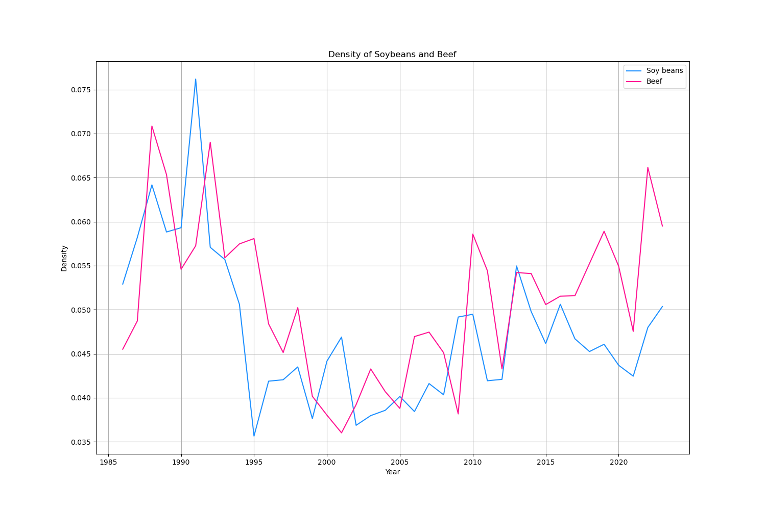
Higher density of network refers to a greater average value of the virtual water trade among countries and a closer relationship. In the graph, it shows a critically lower tendency in its early 2000s. Infering this from the journal article, the financial crisis in 2008 led to the decline of world trade. Then, it increases as recovering severe previous drop for both soybeans and beef.
In and Out degree of soybean and beef within the Top 7 most frequent countries (2023)
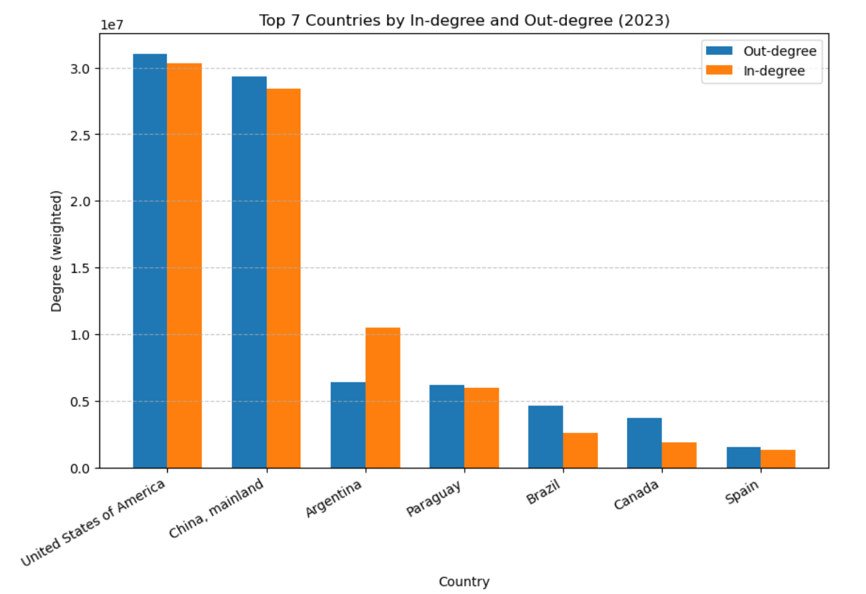
In 2023, the most latest year in the dataset, the bar graph of in degree and out detree shows the most powerful and active countries in world trade lately. Needless to say, United states of americal was the most active country among top 7 countries displayed on the bar graph. Second place is mainland China, and both US and China is overwhelming absolute power in the world trade. Rest of them are Argentina, Paraguay, Brazil, Canada, and Spain.
In and Out degree of soybean and beef within the Top 7 most frequent countries
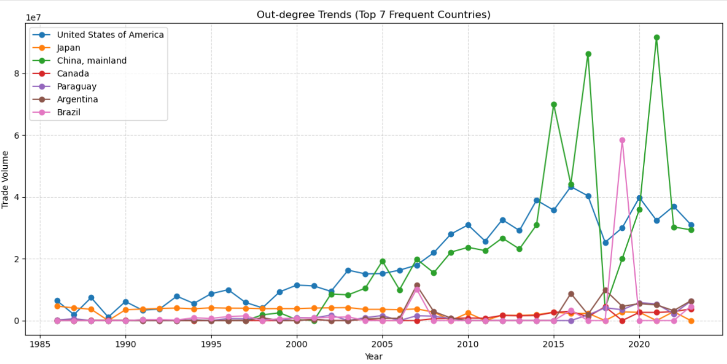
For out degree trend, it shows countries with their power at export. This graph was introduced from sorting all countries yearly then picked top 7 countries that frequently high ranked in its outdegree. Top 7 countries with the most powerful out degree are US, Japan, mainland China, Canada, Paraguay, Argentina, and Brazil.
Again, US is the most stable in its out degree tendency. Interestingly China is a country which experienced the most rapid growth in recent export degree. Also Brazil, twinkle and disappeared in 2019.
One noteable thing was most of the countries had their exprot crisis in 2019-2020, which was COVID-19 period. However, Brazil is the one who had their remarkable export degree. According to external news articles, this was because Brazil replaced China’s position during China’s strict quarantine period in COVID-19 period.
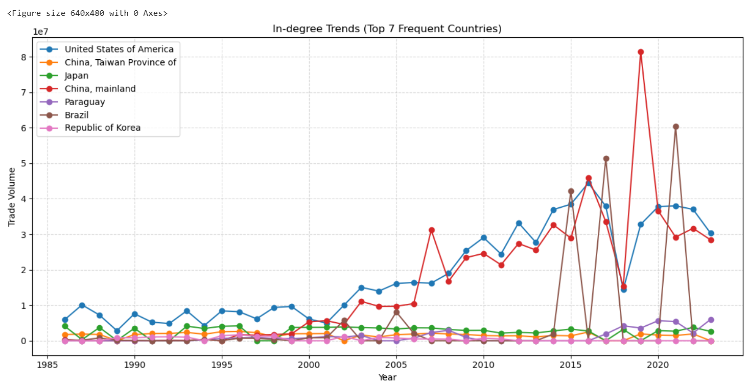
In degree trends shows countries are shown with their degree of import. This graph was introduced in the same way as out out-degree trend analysis. The top 7 countries with the most powerful import were: US, Taiwanese China, Japan, mainland China, Paraguay, Brazil, and Republic of Korea.
Regarding import degree, most of the countries show an increasing tendency with some noticeable trends. Most of the country, of course, experienced a significant drop in their import activity during COVID-19. However, mainland China recovered its import degree increased substantially in 2019. According to external news articles, mainland China increased its import rate to recover demand for its supplies due to the shutdown of factories during the pandemic.
Otherwise, Brazil has their increasing tendency towards imports in recent years, but not so stable.
Simple network of soybean and beef trade
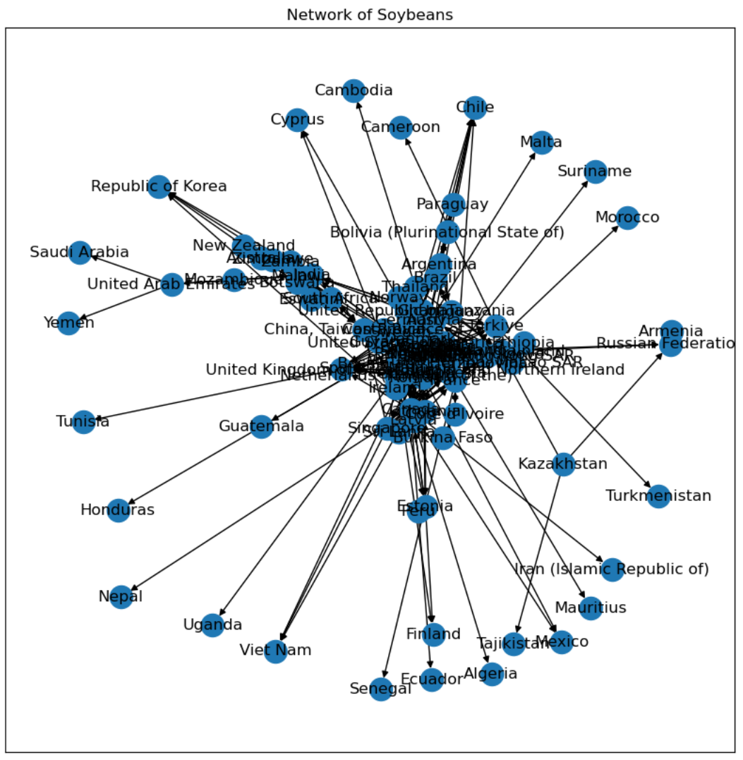
This is a breakdown of each item in world trade. First, this is a directed network graph for soybeans. Most of the countries are well related across each country. It is possible to observe countries that only imports soybeans. However, this graph is not so clear to look at.
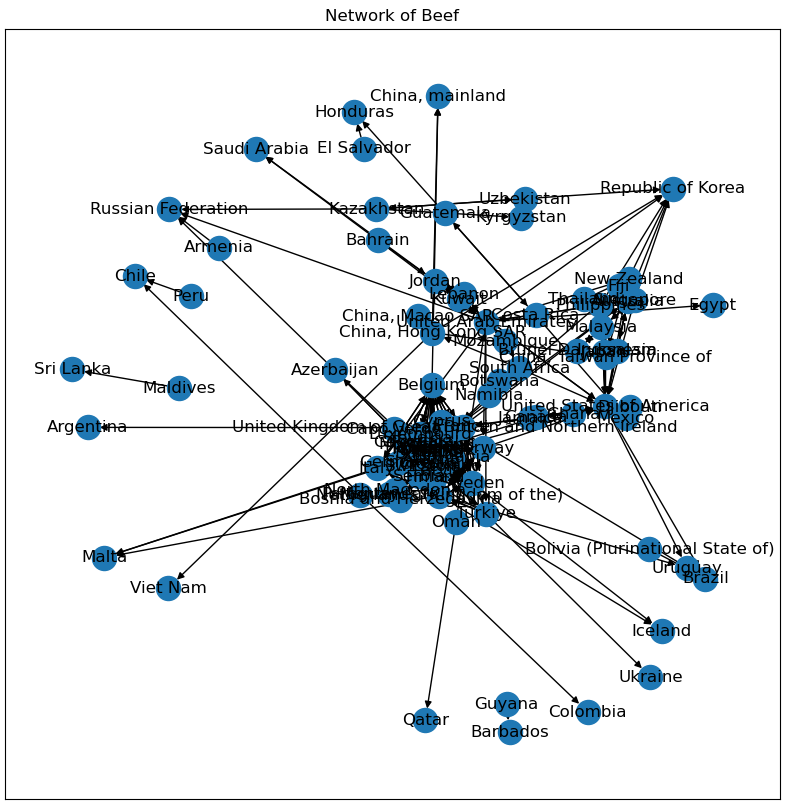
Now, this is a directed network graph of beef. It shows different postures of its network compared to the soybean network. For the Republic of Korea, it shows how many countries the Republic of Korea imports from many other countries. However, this graph is not so clear to look at.
Detailed network analysis of soybean
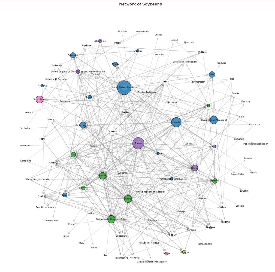
Now, this is a more sophisticated network graph with its arf_layout. The color is based on modularity and betweenness centrality.
What is modularity and betweenness centrality in network theory?
- Modularity
A way to measure how well a network is divided into communities.
- Betweenness
A way to measure how well nodes connect social circles.
These two theory helps to uncover both community structure and key players in gloabal trade networks. Explicitly, US is the most biggest country to trade soybeans. Also, it is possible to see that US is the main player of the world soybean trade domain for all time (1986-2023). Other countries player crucial role in world soybean trade are France, Canada, Taiwanese China, Austria, Germany and Kingdom of the Netherlands.

Observing this infographic, it is possible to see that US is the most biggest country in soybeans trade. However, there is a rapid increase in Brazil that overtook US. It is not reflected on the network graph as it is so rapidly increased in short period while the graph shows cumulative interactions.
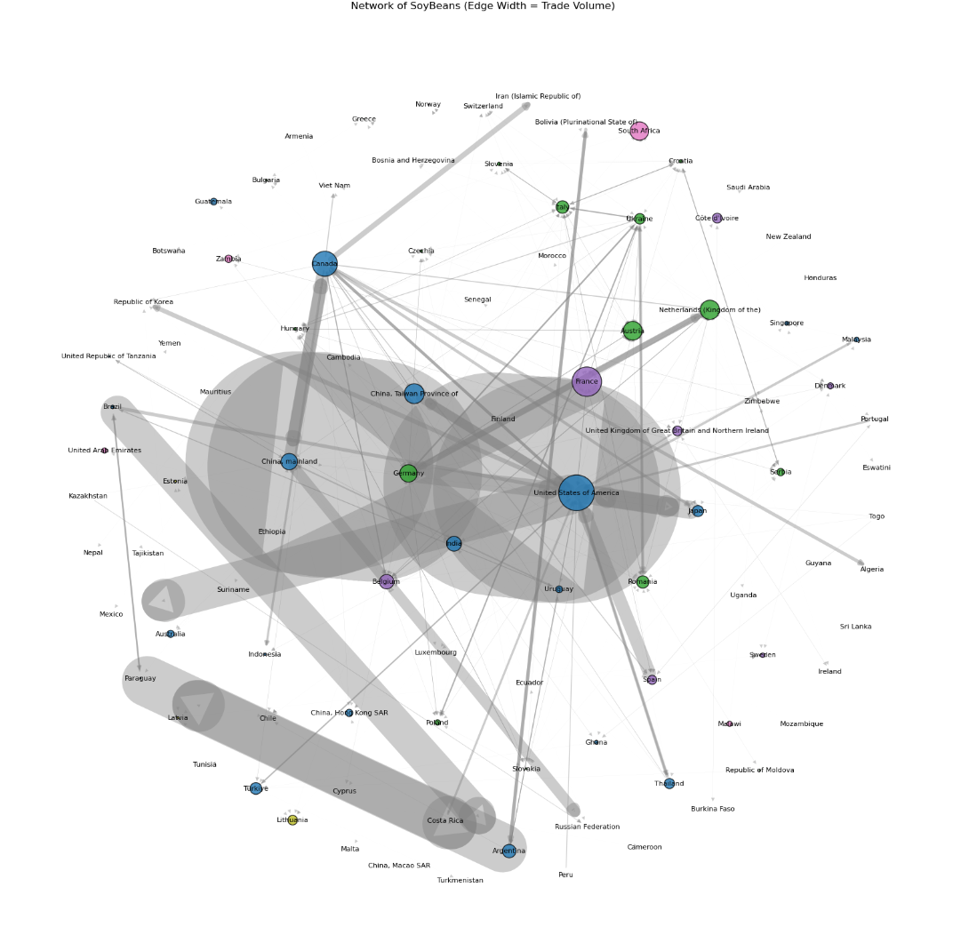
The next visualization reflects the volume of soybean trade with the width of the edge. The US is the most powerful country in the soybean trade. Countries in blue have meaningful and explicit interaction in this graph.
Detailed network analysis of beef
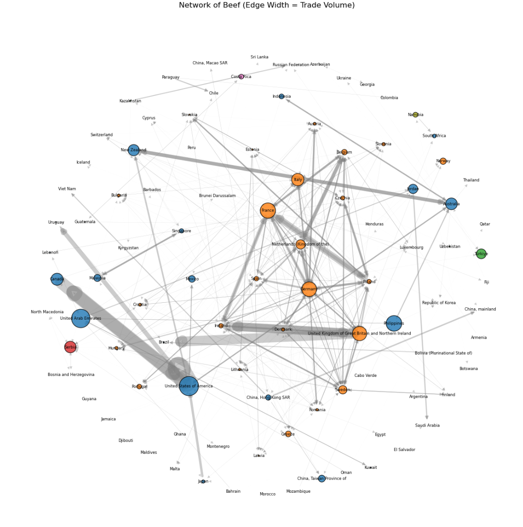
This is a network analysis of beef and reflecting the edge width of its trade volume. In this graph, it is possible to see that European countries, France, Germany, Italy, Netherlands, United Kingdom have having dense relationship with each other in the beef trade. Globally, the US, United Arab Emirates, Canada, the Philippines, Australia, Jordan, and New Zealand have bigger size of node size. It is very interesting to see that geographically close countries like {US, Canada}, {Australia, New Zealand, the Philippines}, and {United Arab Emirates, Jordan are interacting with each other in trade of beef.

Along with this infographic, the EU is a country exporting and importing beef from other countries. Also, countries like Brazil, India US, Australia, Canada are big players in the world beef trade. This is the statistic infographic only regarding 2023, so it may be different from what the network graph shows.
Network of world soybean and beef trade
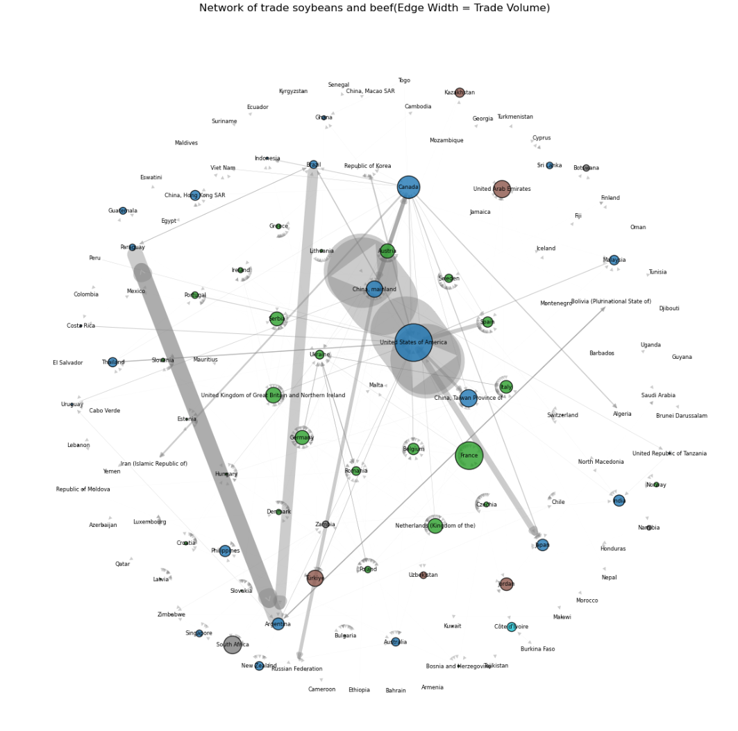
The network of integrated world soybean and beef trade shows how the world trade in those items is forming its communities.
- Green colored node countries
France, United Kingdom of Great Britain and Northern Ireland, Serbia, Netherlands, Romania, Belgium, Portugal, Greece, Austria, Sweden, Spain, Italy, Szechia, etc.
Those are European countries, and this shows how they are connected through world trade, not only on the continent.
- Blue colored node countries
US, mainland China, Brazil, Canada, Taiwanese China, Thailand, Philippines, Argentina, Japan, India, Argentina, Hong Kong, Guatemala, etc.
Those are Asian, American countries, and this shows how Asia and American countries are mainstream and a broad community in world trade.
- Brown colored countries
United Arab Emirates, Kazakhstan, Turkiye, Jordan
Those are Middle East countries, and this shows how those locally close countries interact through world trade in soybeans and beef.
- Grey colored countries
South Africa, Botswana, Zambia, etc.
Those are mostly African countries, and this shows how they are connected within one continent, Africa. However, that community is not so mainstream, closer to outsiders.
Interactive soybean and beef world trade flow visualization
This is a Global soybean trade interactive network graph. You can hover over country names, zoom in, and out to observe.
This is Global beef trade interactive network graph. You can hover over country names, zoom in and out to observe.
Look at how the world soybean and beef trade are different in volume by region or continent.
Explanation of analysis
This project used weighted directed graphs to represent soybean and beef trade networks between countries. Key network metrics such as in-degree, out-degree, betweenness centrality, and modularity were used to analyze the structural importance of countries in global trade.
- In-degree: Total imports from other countries.
- Out-degree: Total exports to other countries.
- Betweenness centrality: Measures a country’s role as a bridge in the trade network.
- Modularity: Used to detect communities within the network, representing trade blocs or regional clusters.
Trade networks were constructed from FAO bilateral trade data, and visualized using both networkx (static graph) and plotly (interactive global map).
Showing codes + result
If you want to check the whole code PDF file of this project, visit: Soybean_beef_networkx_project
Interpretation
From the out-degree and in-degree trends, we observe that:
- United States and mainland China have consistently traded very actively for several years.
- In recent years, Brazil has become rising country in world trade in both import and export.
- European Countries, Asian, American Countries, Middle East Countries, African Countries are clustered in their trade along with geographic and political distance.
- For soybeans, US, main land China, France, Taiwanese China and Canada are notable 5 countries in their soybean trade.
- For beef, US, UAE, Philippines Australia, and New Zealand are notable 5 countries in their beef trade.
These results align with global economic trends and indicate how geopolitical or environmental factors may shift trade flows.
Best regards,
Thanks for making it to the end!
If you’re fascinated by how Python and NetworkX can uncover the hidden structure of global trade, you’re one of us.
Got questions? Curious about another product’s trade network?
Drop a comment below and I might cover it next time (yes, even soybeans and beef 🫛 🐂).
And hey — if you enjoyed the analysis, click the heart🩷!
It motivates me to dive deeper into the data ocean.
Until next time, data nerds! 📊🐍


Leave a comment