[Data Science Project] How Migration Shapes Florida's Racial and Educational Gaps: A Community Detection Approach
Introduction
Understanding spatial inequality requires more than examining socioeconomic indicators in isolation. This project explores how migration-based community structures in Florida relate to racial composition and educational attainment. Using county-to-county migration data and US Census statistics, this blog explains how I applied Louvain community detection and visualized educational and racial disparities across communities.
About Florida
| 10 Fun Facts About Florida |
|---|
| Approximately 46 million people visit Walt Disney Resort annuallyWhere to visit in Florida |
| The first suntan lotion was invented by Benjamin Green in Miami Beach in 1944. |
| Key West has the most bars per capita than any other place in the country. |
| Florida has more golf courses than any other state in the country. |
| There are over 30,000 lakes and 1,000 golf courses in the state. |
| Florida has 34 commercial wineries. |
| Gatorade was named after the University of Florida Gators, where it was first developed |
| Florida’s oldest tree is 3500 years old and is located just north of Longwood in Big Tree Park. |
| Florida produces 75% of the oranges in the US! |
| Florida is the only place on earth where alligators and crocodiles co-exist in the same habitat. |
Source: Annett
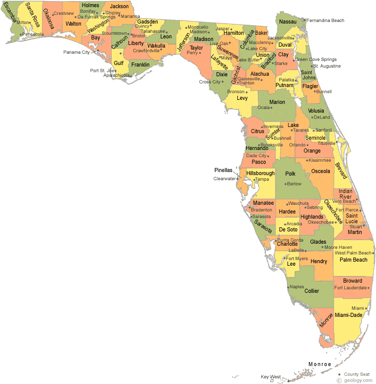
This project analyzes Florida migration by county. Please refer to the county map of Florida above!
Data and Preprocessing
Data used
- Migration Data: US Census Bureau’s 2016-2020 county-to-county migration flows for Florida.
- Demographic Data: ACS-derived variables on race, income, education, commute time, etc.
After filtering for intra-Florida migration, I built a directed weighted network and mapping visualizations, joined node-level attributes, retaining key variables such as:
median_incomeshare_white,share_african,share_asian,share_alaska,share_hawai(racial proportions)share_bachelor,share_master, etc. (educational attainment)
Migration weight and Network between counties in Florida
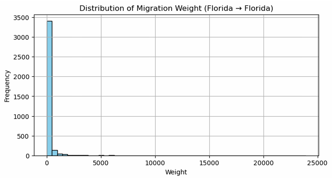
This histogram was plotted to see the weight of migration within Florida.
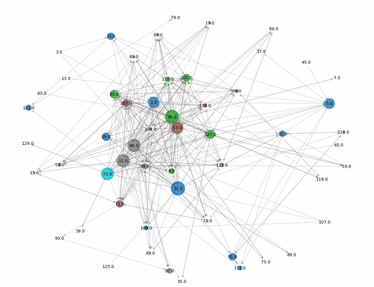
This is a network visualization of migration within Florida’s counties.
- Node: Florida’s Each county
- Number on node: County Code
- Node size: betweenness centrality
-
Node color: modularity
- The biggest node is a central county.
- Same colored nodes are in the same community (group with more within migration flow)
- Edges from center to outer part: Non-central county → migration to hub county
Community Detection
Girvan-Newman
Description
The Girvan-Newman algorithm is a divisive hierarchical clustering method used for community detection in networks. It repeatedly removes edges with the highest betweenness centrality, thereby breaking apart the network into smaller subgraphs. This method is useful when the underlying community structures are loosely connected, but its computational cost is relatively high for large graphs.
Community Visualization
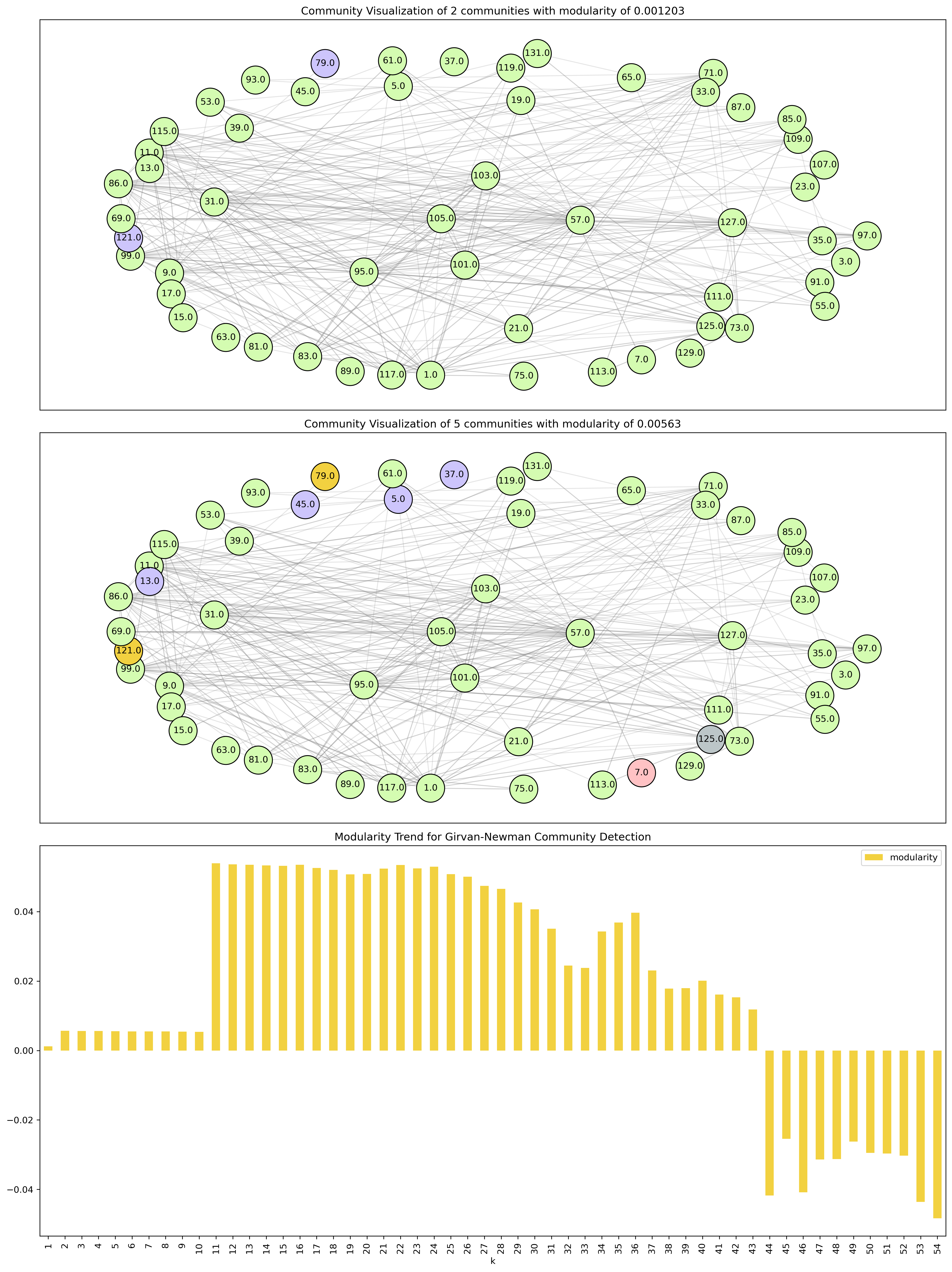
This community visualization shows the community partitioning from Girvan-Newman on the Florida county migration network. Each node represents a county, and the same colors indicate same community it belongs to. As the algorithm proceeds, modularity increases until a peak is reached, after which further splits reduce community quality.
Mapping
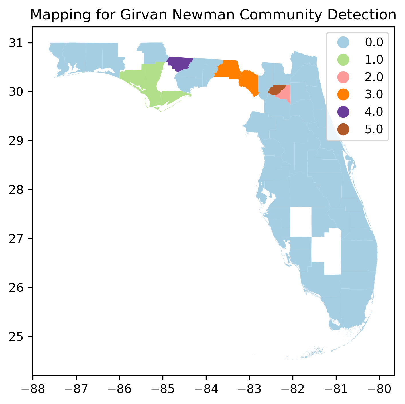
Girvan-Newman algorithm clustered most of the regions in Florida into community ‘0’.
Louvain
Description
The Louvain method is a modularity-based community detection algorithm that is efficient and scalable for large networks. It greedily optimizes modularity and can uncover nested hierarchical structures. This algorithm yielded six interpretable communities within Florida’s intra-state migration network.
Mapping
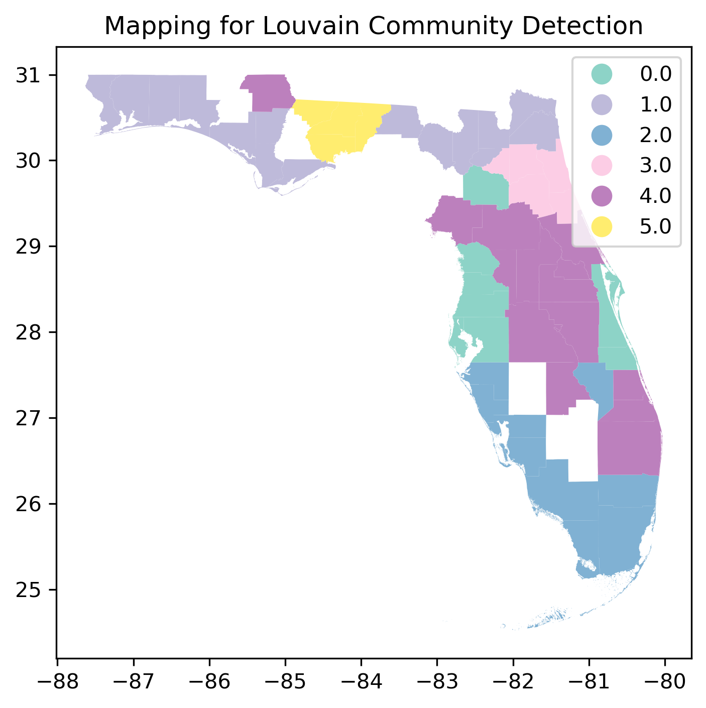
Louvain clustered areas are attached to the same community. Northern Florida is clustered into community 1, while the southern part is clustered to community 2.
Leiden
Description
The Leiden algorithm builds upon Louvain by fixing its disconnectedness problem and ensuring well-connected, stable partitions. It is particularly useful in cases where Louvain may over-partition or generate poorly-connected clusters.
Mapping
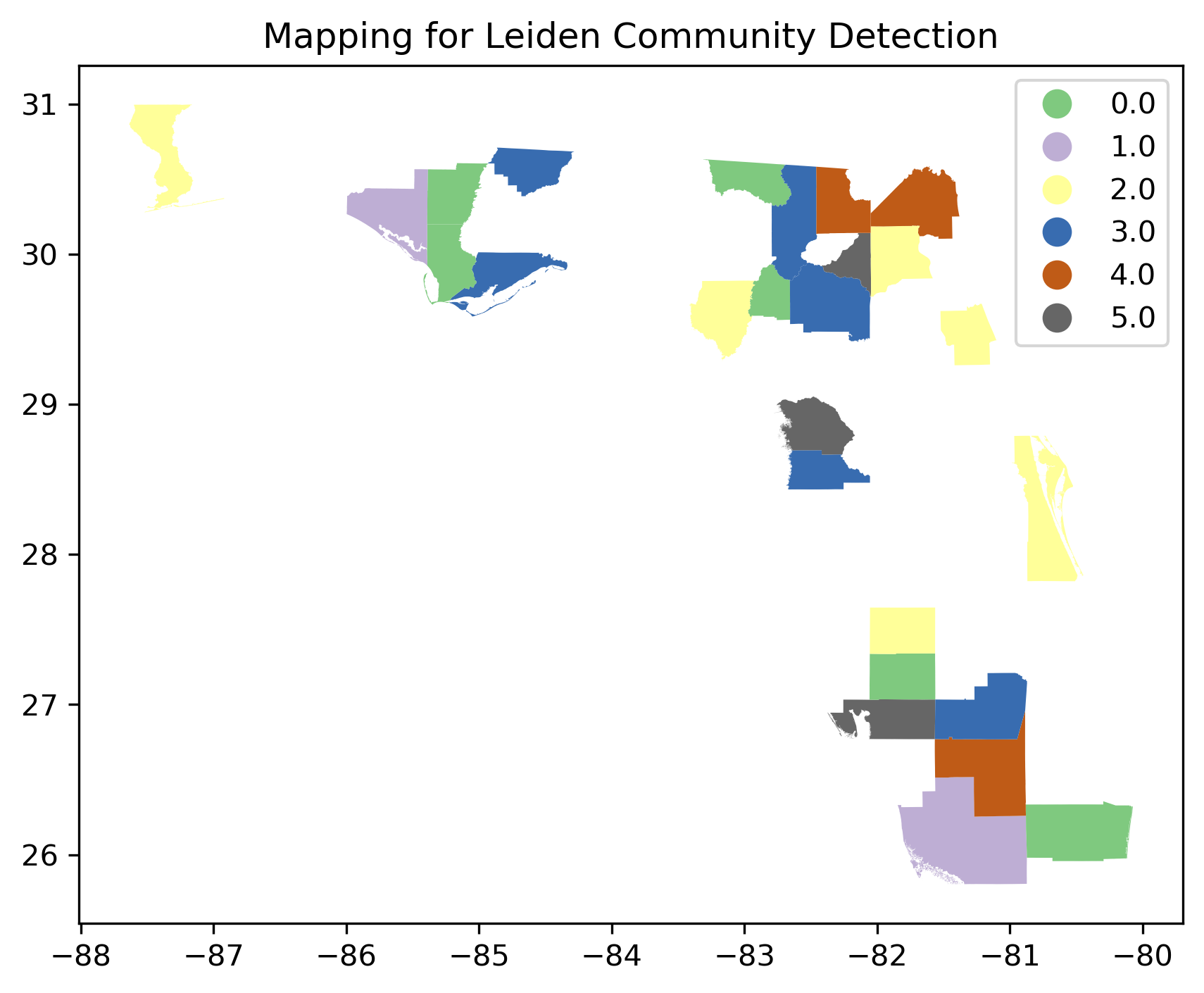
Leiden seems to miss many areas in Florida clustering as communities.
So, in this analysis, the Louvain algorithm is selected as a clustering method as it works the best.
Demographic variation by Community
Race
Boxplot
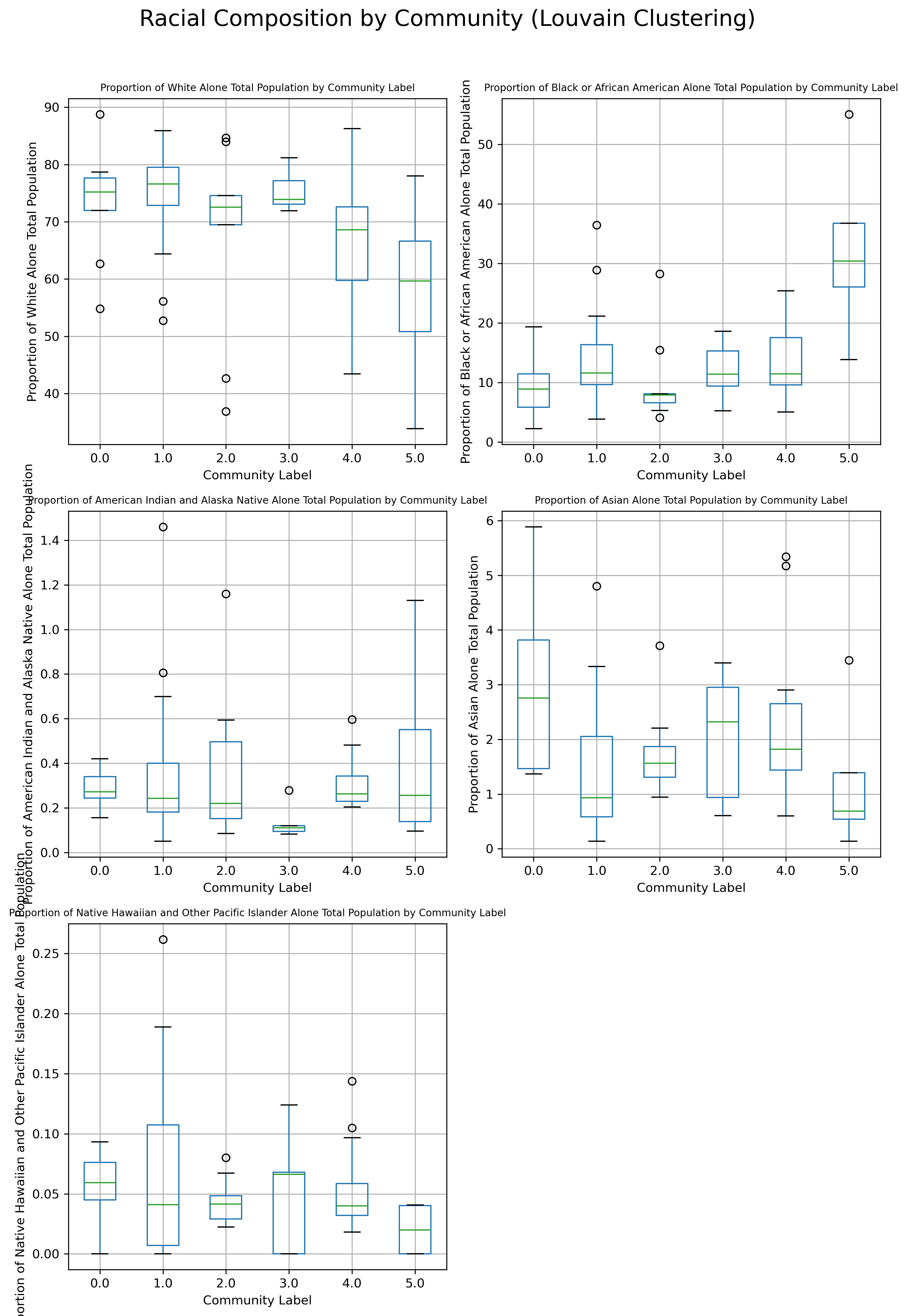
This is a boxplot of racial composition by each community. In the dataset, they contained 5 different races, White Alone, Black or African American Alone, American Indian and Alaska Native Alone, Asian Alone, and Native Hawaiian and Other Pacific Islander Alone. These were divided by the Total population to see the percentage difference. In most communities in Florida, the White population was explicitly dominant. Community 1 contained the highest median of the proportion of the White alone total population. On the other hand, community 5 contained the most varied the most, truly containing many of the proportion of the black or African American population.
For the proportion of the American Indian and Alaska Native, Asian, and Native Hawaiian and Other Pacific Islander population, it shows that they are a minority in communities in Florida.
Mapping
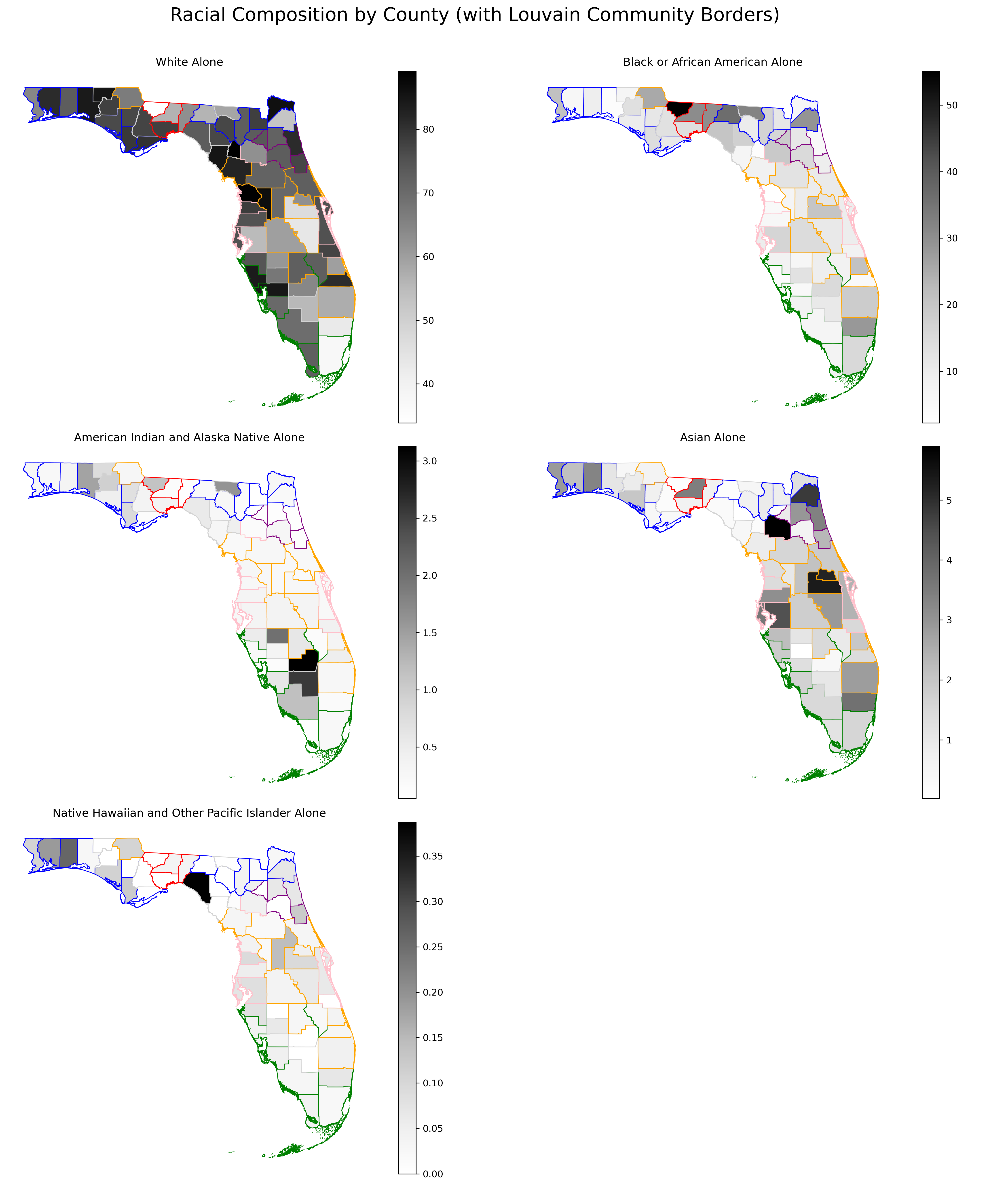
The map shows that Florida is White dominant region, likewise, most of American society is. However, there were some regions containing more proportion of other races.
- The white population is clustered in communities 1 and 4.
- The Black or African American population is clustered in community 5.
- The American Indian and Alaska Native population is clustered in community 2.
- The Asian population is clustered in communities 0 and 4.
- The Native Hawaiian and Other Pacific Islander population is clustered in the outer community.
The White Community is dominant in most counties, excluding Gadsden, Osceola, Orange, and Dade counties. These regions contain Hispanics, or other races than the whites.
Gadsden, in Northern Florida, contained more than 50% of the Black or African American Population in the region. Gadsden County lies within the historical “Black Belt” region — areas in the U.S. South with a historically high African American population due to plantation-based economies.

American Indian and Alaska Native people were mostly in the Glades and Hendry County in Florida.
Native Hawaiian and Other Pacific Islander people were mostly clustered in Talory County.
The Asian Community is clustered in Seminole, Orange, Alachua, and Duval Counties. The Asian Community contains a very interesting community distribution along with Educational Attainment.
Education
Boxplot
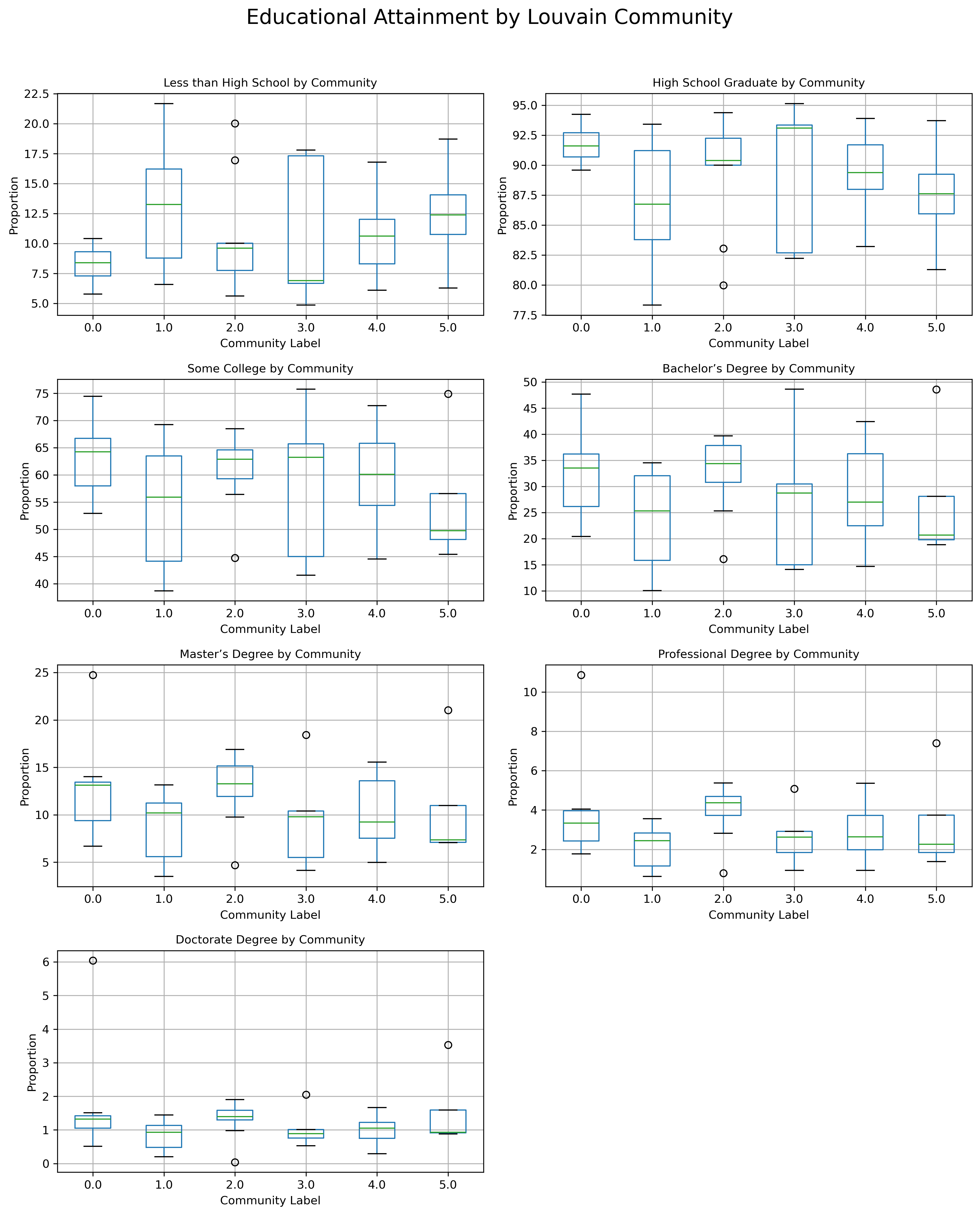
In Florida, most communities contained an education level of High school graduates. Community 3 contained the most dominant proportion in high school graduates and the least dominant proportion in less than high school educational attainment. This shows that community 3 is conducting the basic education well. For higher education, such as college, Bachelor’s, Master’s, Professional, and Doctorate degrees, community 2 contained the highest educational attainment proportion. This indicates that community 2 is the most highly academic.
Mapping
According to the NIH, National Institute on Minority Health and Health Disparities, Florida contained different percentages of educational attainment.
| County | Value(percent) | People(Education: At least Bachelor’s Degree) |
|---|---|---|
| St.Johns | 48.6 | 101,679 |
| Leon | 48.6 | 86,063 |
| Alachua | 47.7 | 81,947 |
| Seminole | 42.4 | 143,383 |
| Sarasota | 39.7 | 143,058 |
| Palm Beach | 39.6 | 439,656 |
| Collier | 39.5 | 118,525 |
| Orange | 38.4 | 376,923 |
| Monroe | 37.8 | 24,381 |
| … | ||
| Miami-Dade | 33.2 | 639,297 |
| Duval | 33.1 | 229,175 |
| Santa Rosa | 31.0 | 42,334 |
| … | ||
| Taylor | 15.1 | 2,357 |
| … | ||
| Glades | 12.7 | 1,219 |
| Washington | 12.5 | 2,317 |
| Madison | 12.5 | 1,705 |
| Hardee | 12.3 | 2,051 |
| Holmes | 12.1 | 1,715 |
| Hamilton | 11.2 | 1,090 |
| DeSoto | 11.0 | 2,810 |
| Hendry | 10.7 | 2,812 |
| Union | 10.0 | 1,119 |
| Dixie | 8.1 | 1,037 |
| Lafayette | 7.9 | 464 |
Source: NIH
Of course, even the smallest percentages ended up as 7.9%, but it does not necessarily mean the worst education level in America.
According to US News, Florida is ranked in its education like the following:
#24 in Educational Attainment
#6 in Best States Overall
#2 in Education
#1 in Higher Education
However, as the US contains varied deviations by state and county, the map of education attainment shows the difference of that.
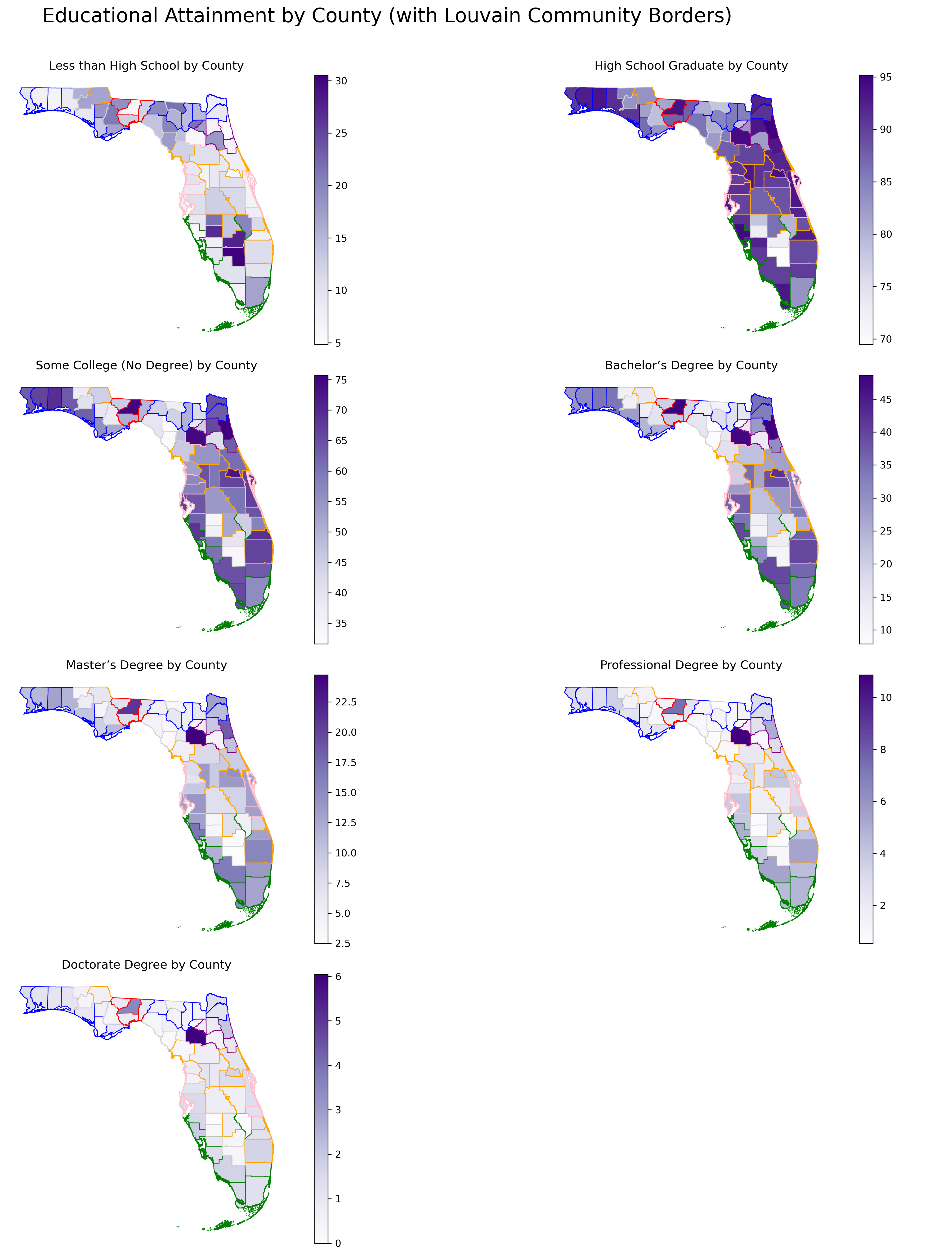
The counties that contained the highest proportion of less than high school were DeSoto, Glades, and Hendry. These counties seemingly need more educational or financial support so that citizen in these areas may achieve at least their high school diploma.
As supported by official NIH statistics, counties such as Leon, Seminole, Orange, Alachua, St.Johns, Palm Beach, Collier, and Monroe contained high educational attainment, more than a college degree, and further, a Bachelor’s Degree.
It is also very interesting that the Asians are clustered in the community containing these counties with higher educational attainment.
Statistical Analysis
ANOVA
ANOVA (Analysis of Variance) is a statistical method used to determine whether there are statistically significant differences between the means of three or more independent groups.
In other words, it tests whether the variation in outcomes between groups is greater than the variation within groups.
In this project, I used one-way ANOVA to test whether demographic variables, such as racial composition or education levels, differ significantly across the migration-based communities detected using the Louvain algorithm.
For example, I tested whether the proportion of residents with a bachelor’s degree varies across the six identified community clusters. If the p-value is below 0.05, we conclude that at least one community differs significantly from the others in terms of that variable.
Race
| Variable | F-statistic | Significant (p<0.05) | |
| 0 | White Alone | 1.719 | No |
| 1 | Black or African American Alone | 5.093 | Yes |
| 2 | American Indian and Alaska Native Alone | 0.767 | No |
| 3 | Asian Alone | 1.669 | No |
| 4 | Native Hawaiian and Other Pacific Islander Alone | 0.678 | No |
The ANOVA results suggest that the proportion of Black or African American residents differs meaningfully across the six migration-based community clusters in Florida. This may indicate regional disparities in racial distribution that align with underlying migration or socioeconomic patterns.
On the other hand, the proportions of White, Asian, and other racial groups do not differ significantly by community, suggesting more homogeneous or evenly distributed patterns across the state for those groups.
Educational Attainment
| Variable | F-statistic | p-value | Significant (p<0.05) | |
| 0 | Less than High School | 1.366 | 0.253158 | No |
| 1 | High School Graduate | 1.366 | 0.253158 | No |
| 2 | Some College (NO Degree) | 1.034 | 0.408083 | No |
| 3 | Bachelor’s Degree | 1.233 | 0.308282 | No |
| 4 | Master’s Degree | 1.552 | 0.191306 | No |
| 5 | Professional Degree | 2.088 | 0.082767 | No |
| 6 | Doctorate Degree | 1.584 | 0.182271 | No |
ANOVA results revealed no statistically significant differences in educational attainment across Louvain-defined community clusters. While the share of counties with higher proportions of professional and doctorate degrees showed slightly elevated F-statistics, the differences were not strong enough to be considered significant at the 5% level.
This suggests that, unlike race, education levels are more uniformly distributed across migration-based communities in Florida, at least at the county level.
Net Migration visualization
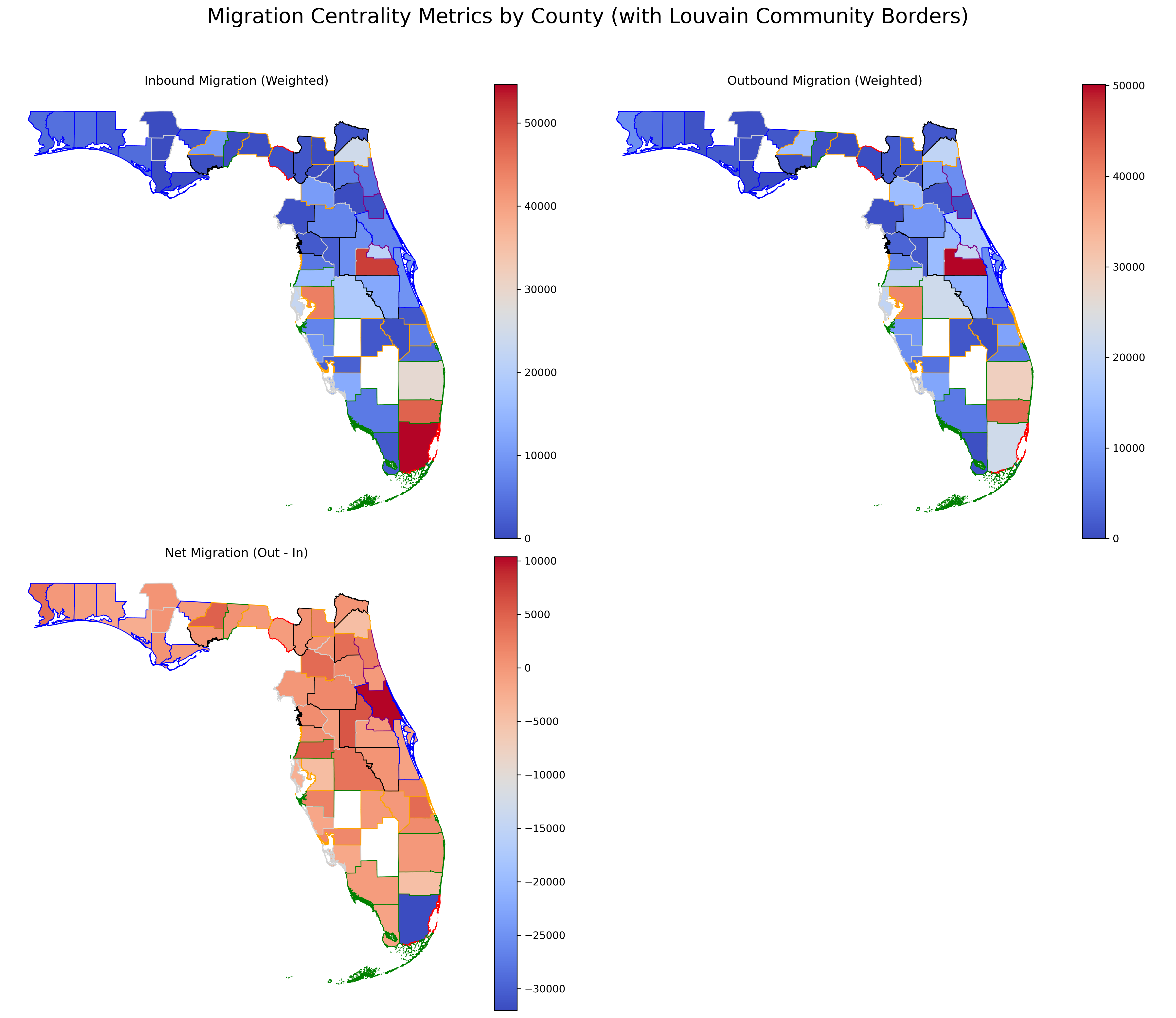
The migration centrality maps provide a deeper look into the spatial dynamics of population movement in Florida. High inbound migration is concentrated in southern urban hubs, but these same areas also report strong outbound migration, resulting in net losses. Central Florida, on the other hand, shows signs of population consolidation, with a net positive migration rate and relatively balanced movement patterns. These patterns reflect both push and pull factors such as cost of living, housing availability, and job concentration.
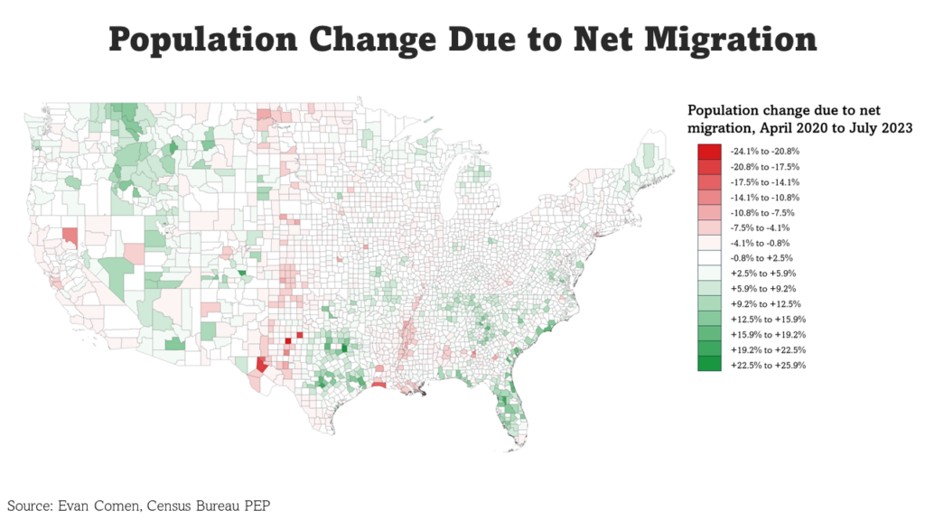
Central areas of Florida are experiencing increased population over the years.
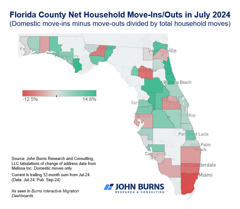
As the map above shows, it is official that Miami-Dade County has been experiencing severe population loss recently.
Why is that?
According to Miami New Times, more people are leaving Miami-Dade than any county in Florida. This is mostly because of the high cost of living and the unaffordable housing market. The additional two counties to the north, Broward and Palm Beach, also experienced net domestic migration losses in 2024.
More than 26,000 residents in Broward and 7,500 in Palm Beach left the respective counties they once called home.
The soaring housing costs, nonstop traffic, and rising inflation rates in Miami, in particular, have left people no choice but to leave for other parts of the country.
Residents have recently taken to the r/Miami subreddit to complain about their wages not keeping up with the rising housing costs. If you are interested: Click
Interactive Map of Florida’s Net Migration
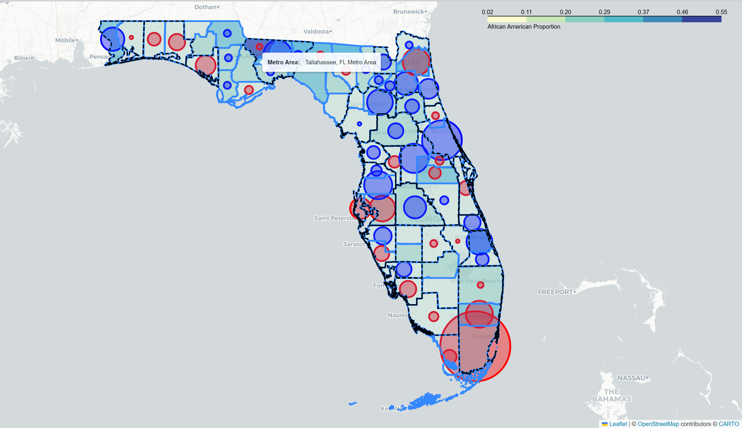 ↑ Click the picture above to see the Interactive Florida Net Migration Map
The map above visualizes county-level migration patterns in Florida by combining racial and migration data. The background shading indicates the proportion of African American residents, with darker tones representing higher concentrations. Circle markers show the magnitude and direction of net migration: larger circles indicate greater movement, while blue bubbles reflect net population gain and red bubbles indicate net loss. Additionally, dashed black lines outline the metropolitan statistical areas (MSAs), helping to situate migration trends about regional economic hubs.
-
Southern Florida, especially around Miami, shows both a high African American population and net out-migration, indicating demographic concentration but potential push factors (e.g., cost of living).
-
In contrast, central inland counties tend to show positive net migration (blue circles) despite moderate diversity, possibly suggesting they are attractive for resettlement.
-
The overlap between MSAs and migration patterns shows that some metro areas are gaining, while other,rs like Tallahassee experience mild outflows despite being urban.
This layered map allows us to understand the intersection between racial composition, migration flows, and urban structure in Florida, revealing which communities are growing, declining, or diversifying.
Full Code
If you are interested in this project, you can check out my full code at this link!
Thanks a lot for reading!
If you found this project insightful, please consider leaving a like, sharing, or subscribing to stay updated on more data-driven explorations.
Got questions, ideas, or feedback? Feel free to drop a comment or reach out — I’d love to hear from you!
- If you’re from Florida, does this map reflect your lived experience? Let me know in the comments!
🔔 Stay tuned with me for more posts on Python, spatial analysis, and applied data science projects.
❤️ A single like goes a long way in supporting independent research and sharing open data work!


Leave a comment